
Artisanal ImportsIn Pursuit of Distinction
A logo identity redesign led to over ten years as a brand ambassador. Together we have weathered an ever changing import beverage landscape by staying nimble, evolving the brand when needed. Left of Sunset provides comprehensive creative direction, consulting, and design of all visual communications for this global craft importer, based out of Austin, Texas.
Artisanal Imports is not a brand collector, they are a brand builder. Partnering with distinct world-class, multi-generational beverage producers from Europe and beyond, overseeing efficient distribution, and sharing stories with American consumers about award-winning beer and spirits that are honestly made and very drinkable. Distinction is earned, through persistent, purposeful work.
|
ESSENTIALS
Logo & Identity System
Visual Brand Strategy Tagline Creation Advertising Wearables Trade Show Graphics Print Sales Collateral Print Production Management 
|
|
|
|
COLLABORATING
YEARS
|
BRAND
PARTNERS
|
COUNTRIES
SERVED
|
|
|
|
Elevate brand image and connect people to places where the products are hand-crafted. There is a rich story to be savored in every sip.
|
Perfected Over Time
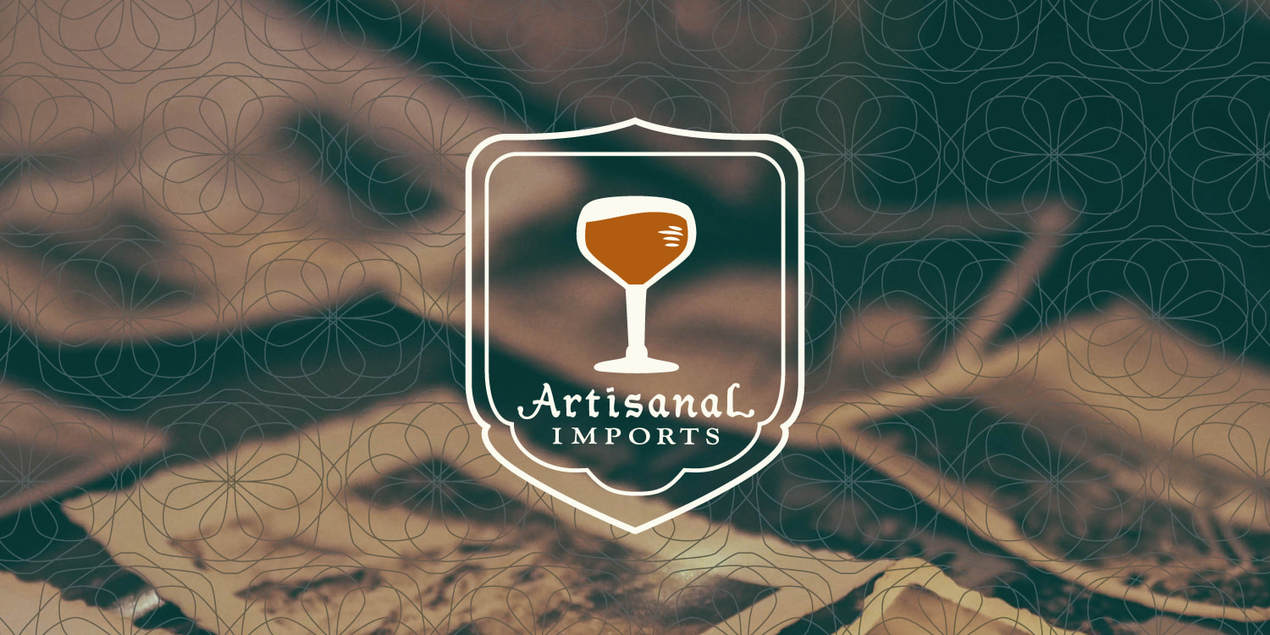
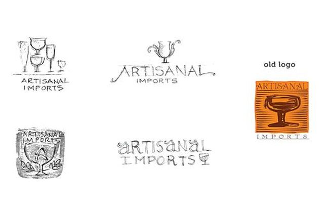
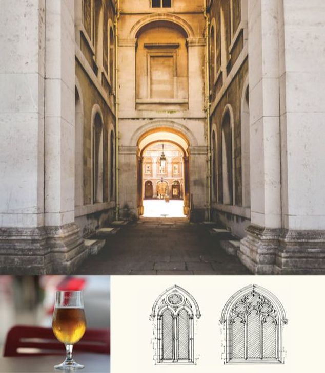
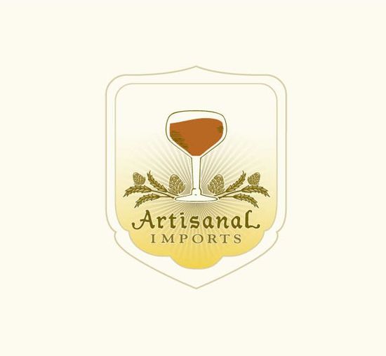
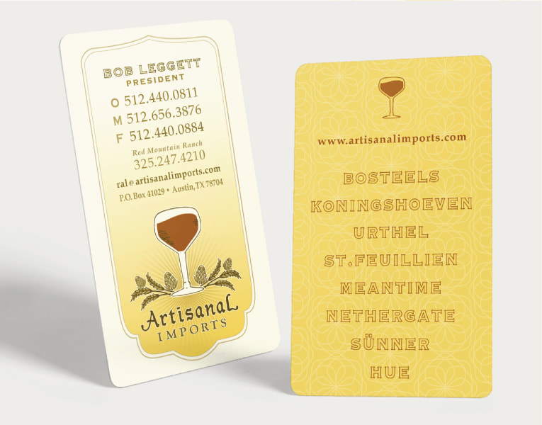
When Left of Sunset was commissioned to redesign Artisanal Imports logo, they had been in business for about 5 years. The logo graphic was found clip-art that did not reflect the extensive craft import experience of the founding partners, Bob Leggett and Lanny Hoff. It also spoke nothing about the premium quality of the producers in their small portfolio of beers from Belgium, Germany, and beyond--some breweries, such as La Trappe are over 100 years old. These producers make beer with authenticity and traditions that have been perfected for many decades and some for over a century. This needed to be honored. |
|
|
|
Cup runneth over
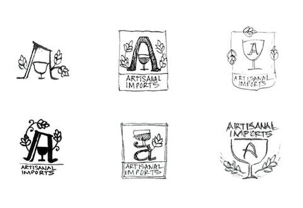
At first, we explored highlighting the letter “A” as an opportunity to call attention, playing on the idea of “ace” and “best” that often comes to mind with this leading alphabet letter.
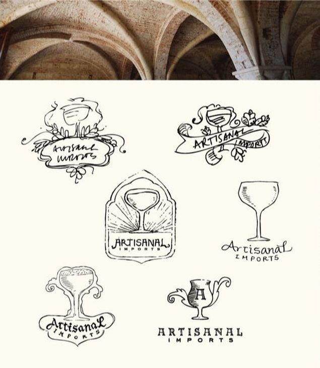
After discussions with the client, we learned that it is traditional for many European breweries to create a custom glass to best feature the aromas and flavors of their beers. The glassware acts as a thumbprint and stands for consistent quality. |
The movement of amber colored beer is captured with a subtle "swish". A little wink to say, "Prost!
CONCEPT: We saw the importance of maintaining an iconic glass and sought to evoke artistry by refining the glass shape, cleaning up the overflowing beer and turning the horizontal lines into celebratory light rays. Afterall, a perfect pour requires a steady hand, topping the glass with a perfect, creamy, foam head.
Custom lettering is inspired by illuminated manuscript texts. To finish off the mark, a crest modeled after European architectural details, creates a trusty shield shape. |
|
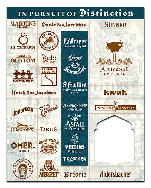
How to celebrate a family of artisanal brands and honor each producer uniquely?
SOLUTION: Ditch the default list format. Feature each producer in one color to unify, cut down on visual clutter, and by limiting the number of spot colors, we can makes offset print production more cost-effective. Most producers did not have a one color logo, so we carefully modified every logo to work.
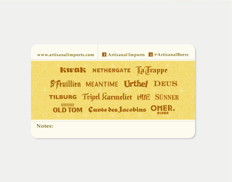
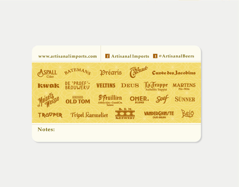
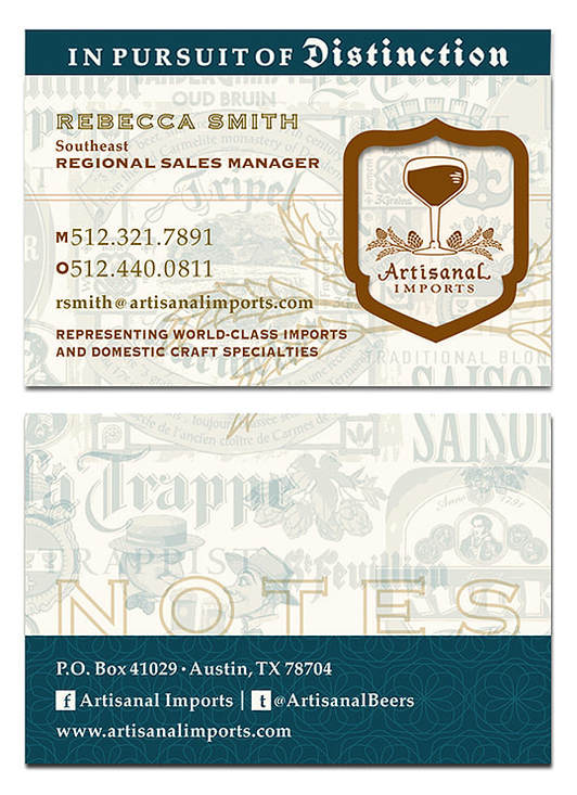
As Artisanal continues to grow, the logos get smaller. Playing scale limbo, we are always mindful of readability. Every few years, we update the back side of the business card to reflect an expanding portfolio. Cards are offset printed on 165lb. cover stock for an artisan feel. The company President and Co-Founder loves the pause and positive reactions he gets when handing out cards. Proof that an effective communication piece requires alignment of both the visual and the tactile qualities. In alignment, these elements create an engaging brand experience both internally and outwardly. |
|
|

People choose to drink craft imports because they expect an extremely unique experience.
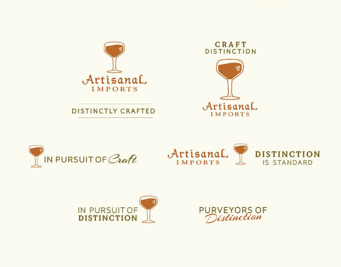
Commemorating the 15th Anniversary of Artisanal Imports, we developed a tagline and reimagined the company business card with a new look. The tagline needed to describe the unpretentious company culture, a discerning taste both internally and of the producers, and communicate a passion, near obsession, with searching the world over to find the best, most drinkable beverages.
We considered words such as Exceptional Taste, Distinctly Crafted, Purveyors of, Choice, Standard until we found the combination that sounded most humble and grounded. Not default. In Pursuit of Distinction compliments the company ethos of Always Forward. |
|
|
Folded business card with a tagline reveal and custom die-cut. Offset printed on 165lb Neenah Classic Crest Cover. Unfolds into a potential coaster.
Printing services provided by QSL.
Printing services provided by QSL.