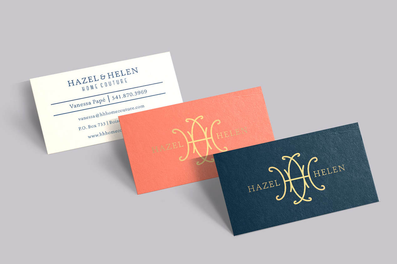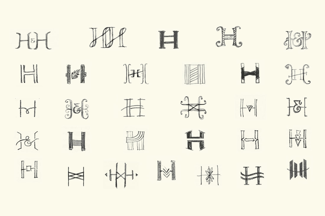
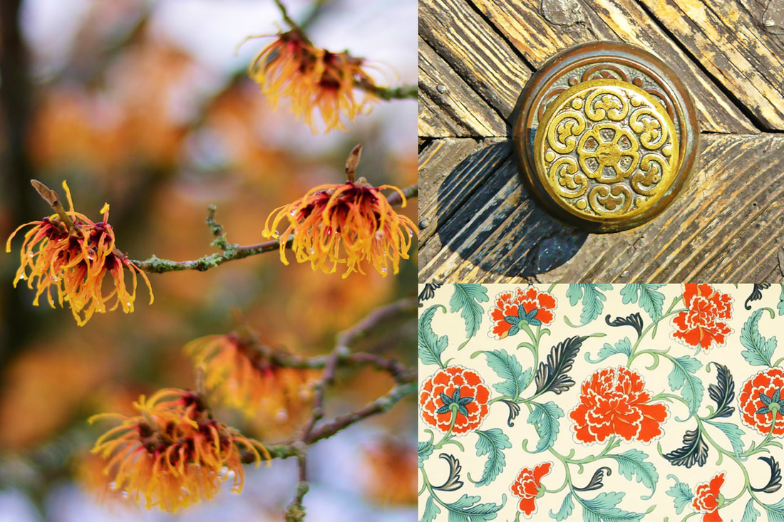
HAZEL & HELENHazel & Helen is an emerging interior design atelier/retailer with a passion for creating personal sanctuaries and timeless spaces. The client, Vanessa, came to us with a story and needed help to create an identity system and business stationery so she could hit the ground running. The company is named after Vanessa's grandmothers, two women who were influential in her life and style approach. For years, she has integrated her grandmothers' antique furniture into her home and the pieces never feel outdated, even decades later. We set out to communicate heritage and pay homage with a classic design that is both feminine and strong. The client's only request was to create a monogram and include a gold accent.
|
ESSENTIALS
Logo & Identity System
Visual Brand Strategy Art Direction Stationery Suite Website Splash Page |
|
|

|


SOLUTION
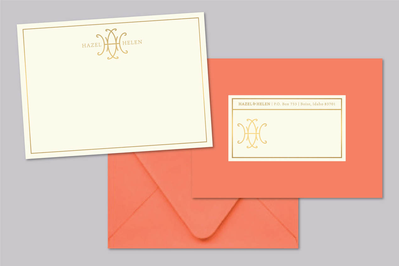
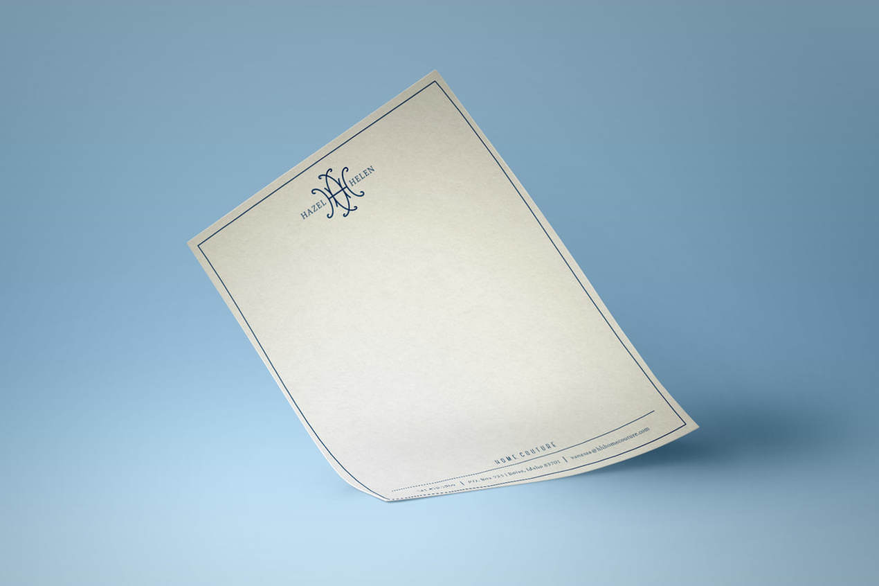
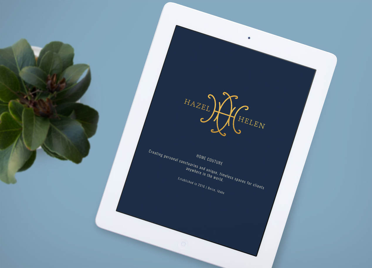
Inspired by the meaning of Helen, a Shining Light, we intertwined the two "H" initials to created a radiating, stylized Hazel flower. The individual letters are retained, but work together in unison. The logo was designed intentionally to be gilded in gold on the stationery and embroidered. Just a little sparkle that Vanessa can pass on to her clients. To keep the brand from feeling old-fashioned, we selected a vibrant coral color that shines alongside calming navy and cream. The elevated simplicity of the completed identity system is enduring.
Inspired by the meaning of Helen, a Shining Light, we intertwined the two "H" initials to created a radiating, stylized Hazel flower. The individual letters are retained, but work together in unison. The logo was designed intentionally to be gilded in gold on the stationery and embroidered. Just a little sparkle that Vanessa can pass on to her clients. To keep the brand from feeling old-fashioned, we selected a vibrant coral color that shines alongside calming navy and cream. The elevated simplicity of the completed identity system is enduring.